Steam Redesign
UX Evaluation | User Testing
3 Weeks

Project Details
Project Overview
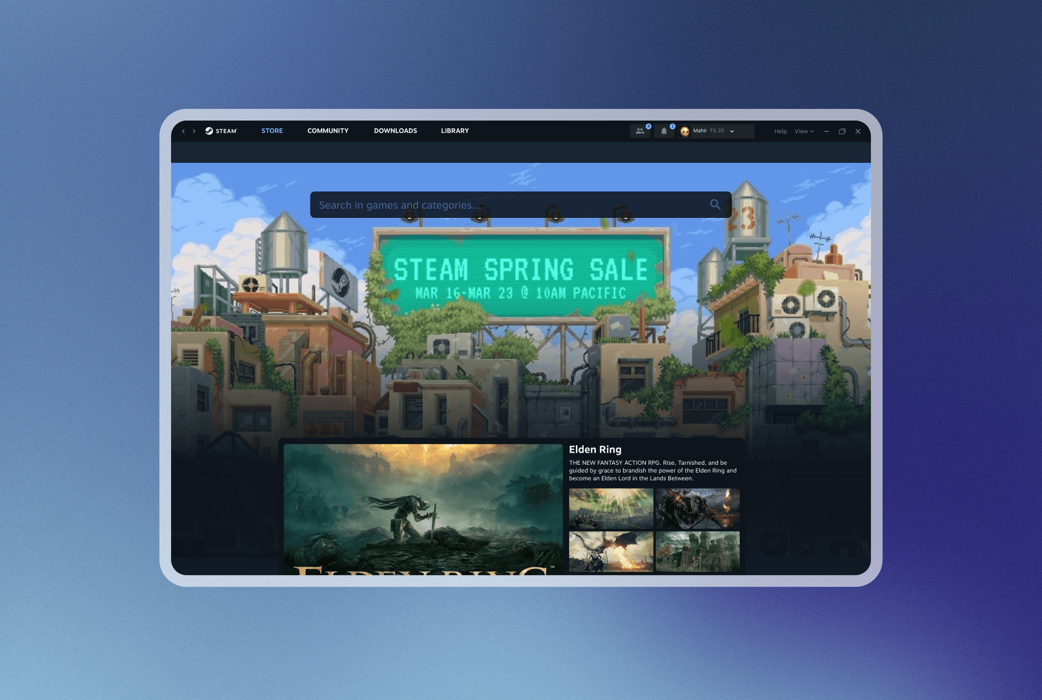
Steam, with its outdated appearance and cluttered menu system, poses a challenge for new players venturing into the world of gaming. Users are met with a user interface consisting of older designs which fetches screens from its web client, which can be redundant and confusing, particularly for those accustomed to more modern interfaces.
Nature of the Project
Product Evaluation
UI Design
User Testing
Project Timeline
Research and Prototyping - 10 Days
User Testing - 4 Days
Team
Mahir Malde (UI Design)
Mahie Rai (User Testing)
Nevaan Petr (UI Design)
Goals & Objectives
INITIal analysis and potential areas of opportunity
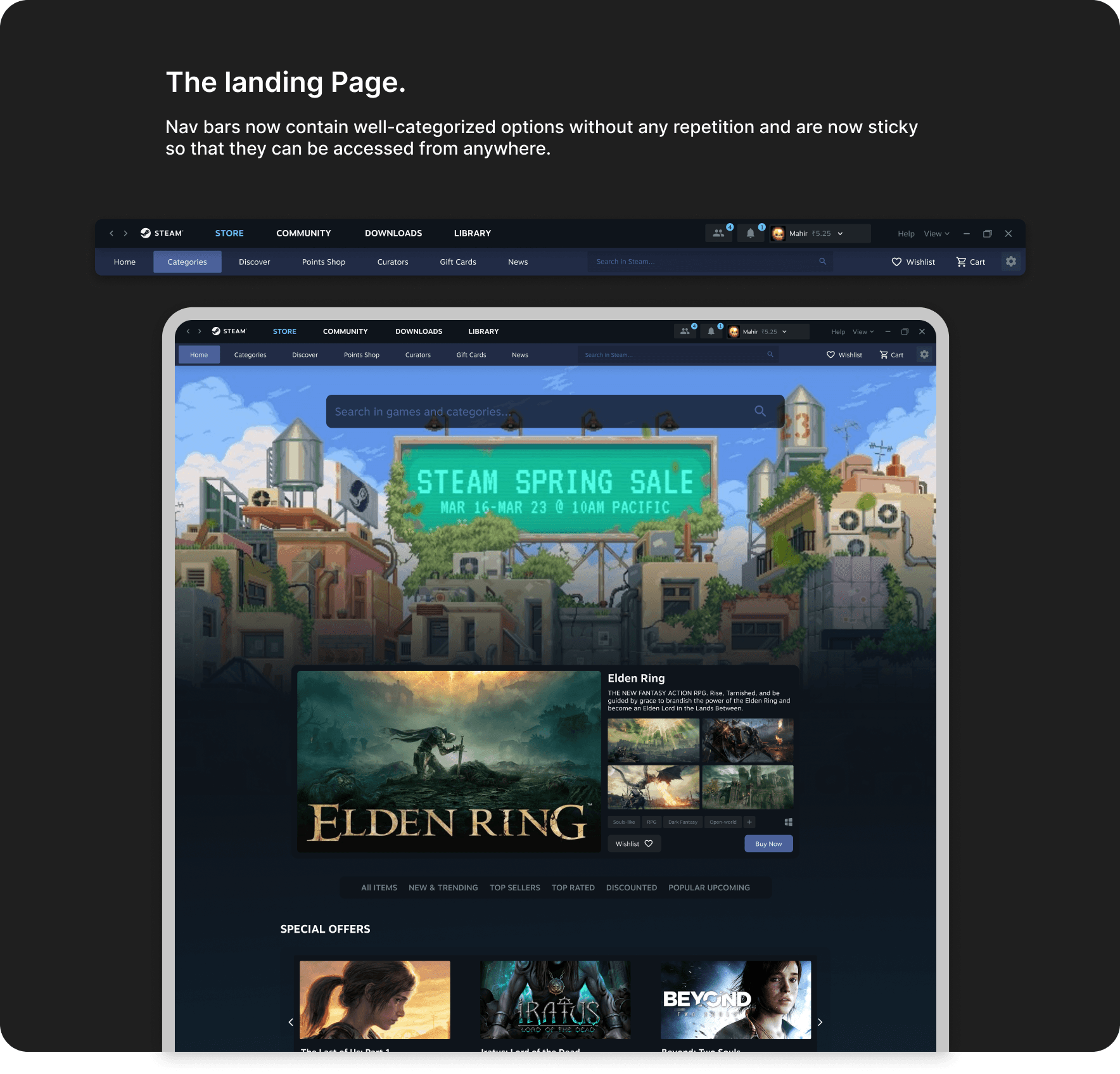
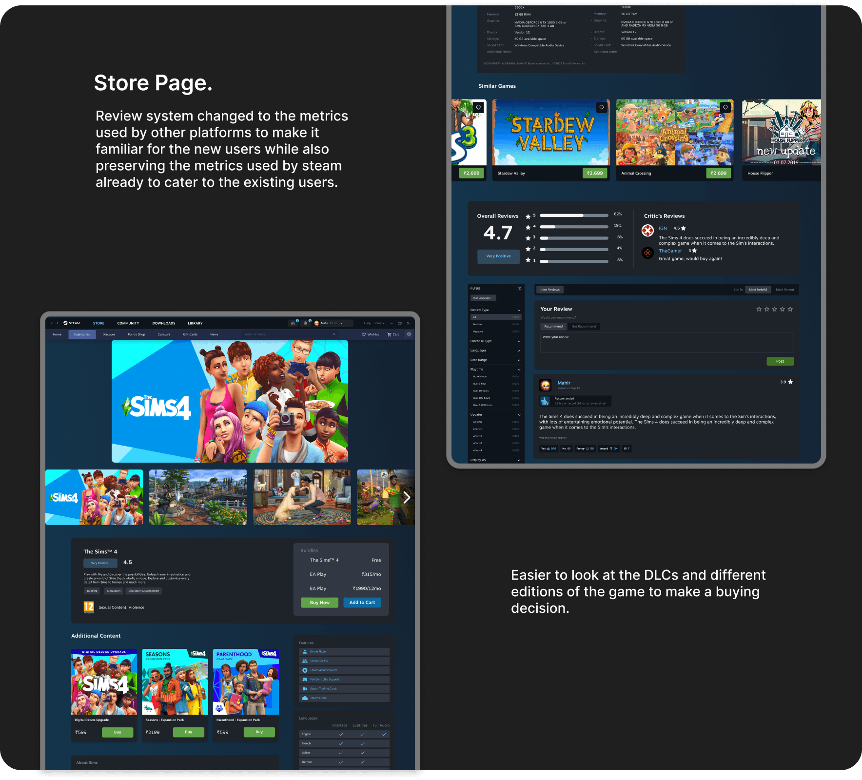
Streamlined Navigation
Implement a unified navigation system that simplifies the browsing experience for users of all levels.
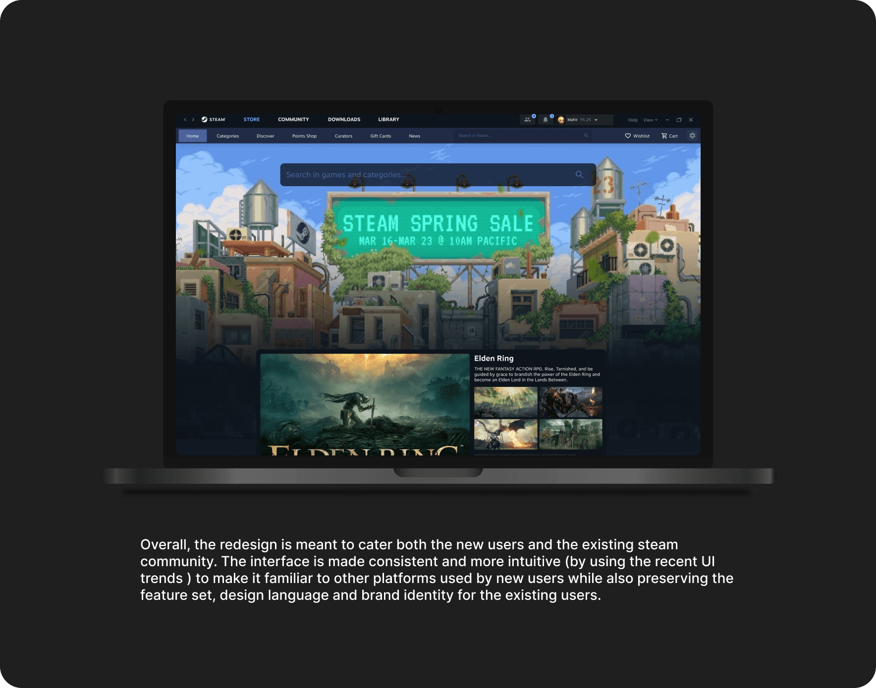
Consistency
The redesign improves interface consistency and visual clarity, enabling seamless navigation of Steam's game library and community features while enhancing usability for all user levels.
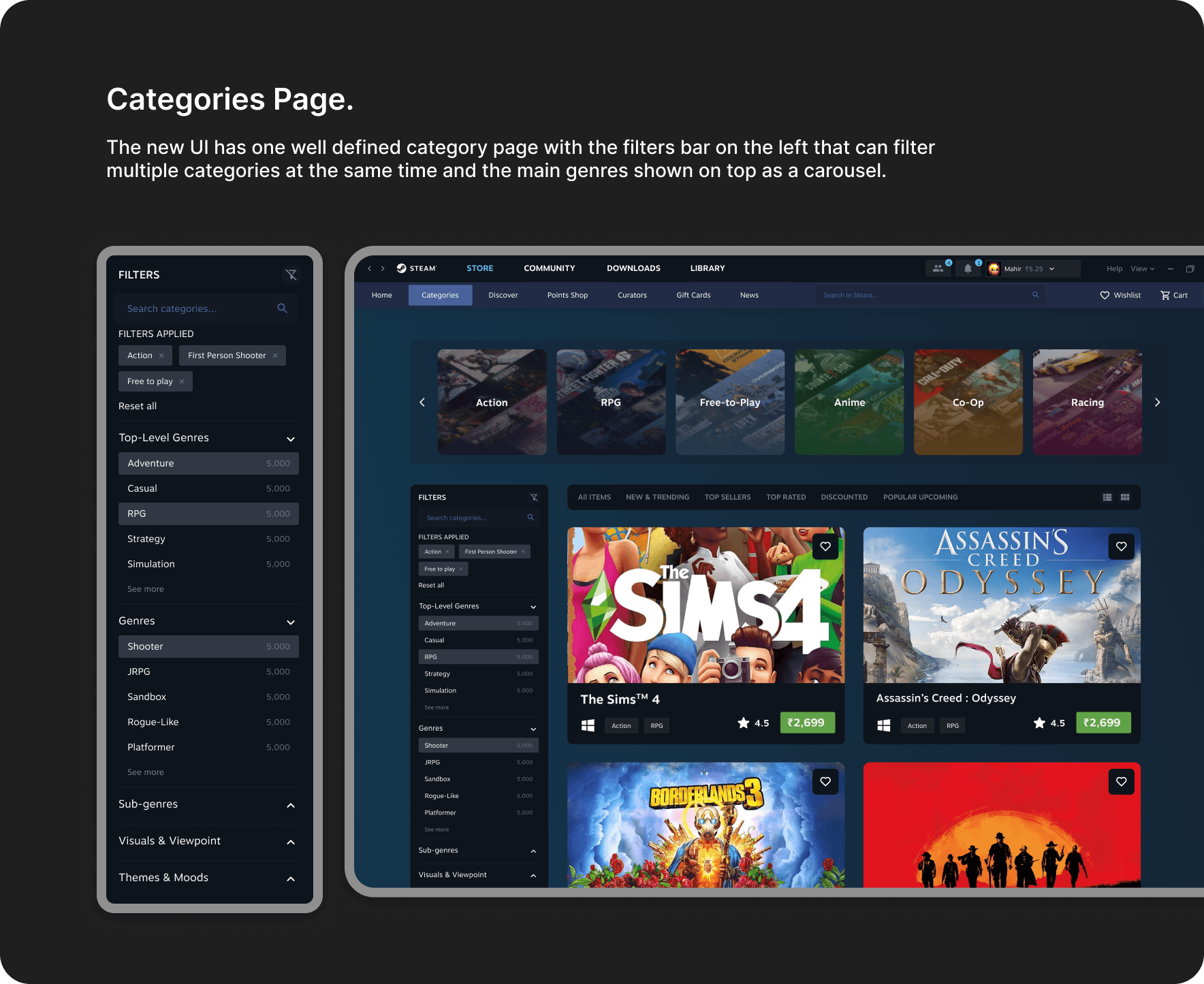
Enhanced Information Hierarchy
Reevaluate the categorization and organization of content within Steam's interface to ensure logical grouping and intuitive access to key features and functionalities.
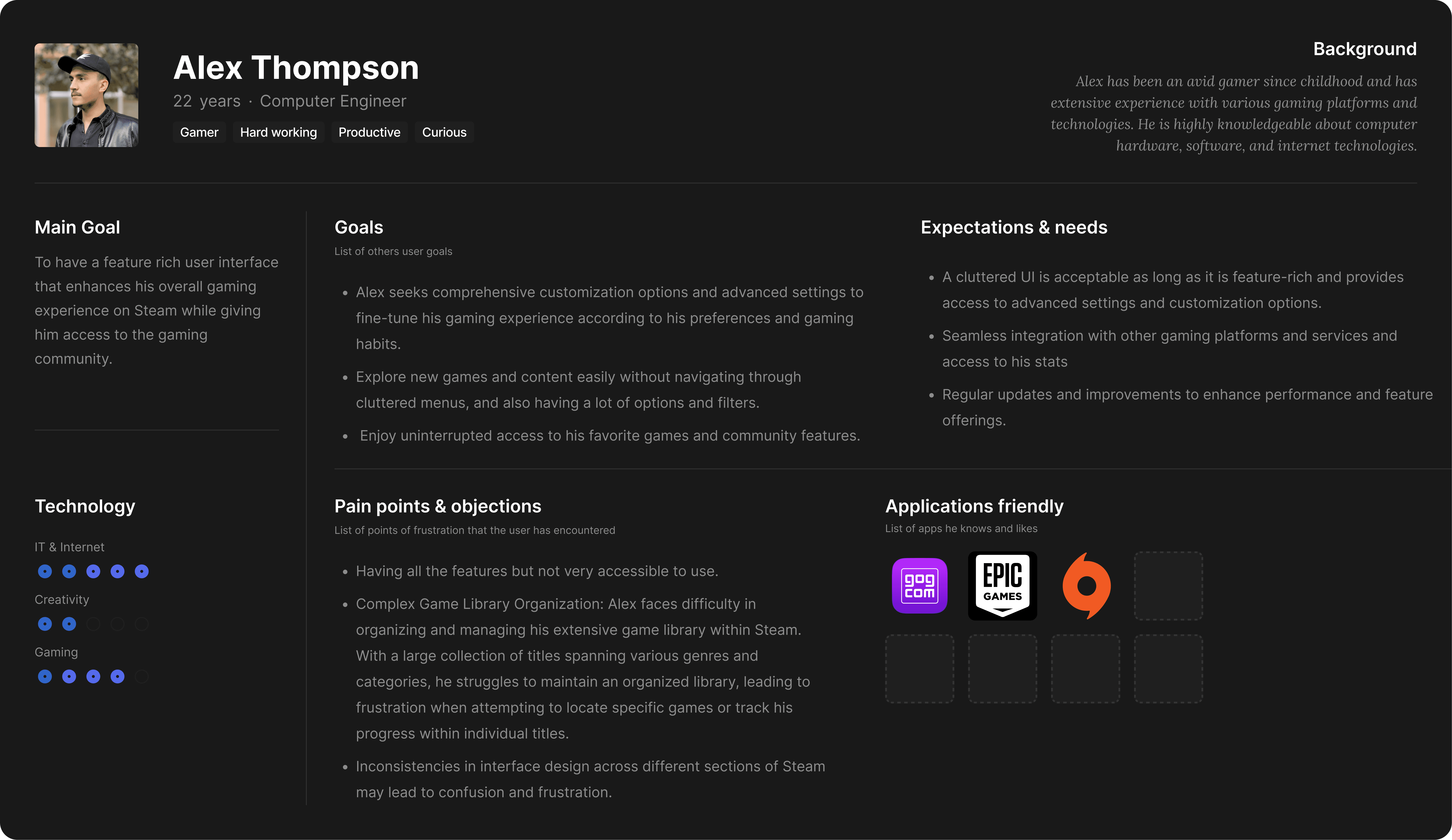
User Personas

Heuristic Analysis

Competitor Analysis
Steam has 4 main competitors with different pros and cons w.r.t the mentioned parameters
Features


Extensive Features
Accessible for new users
Detailed Stats & Information
Visual Design
Access to Community
Prioritization Matrix
The problems identified are grouped in the following parameters to shortlist problems to be taken forward.

User Flow
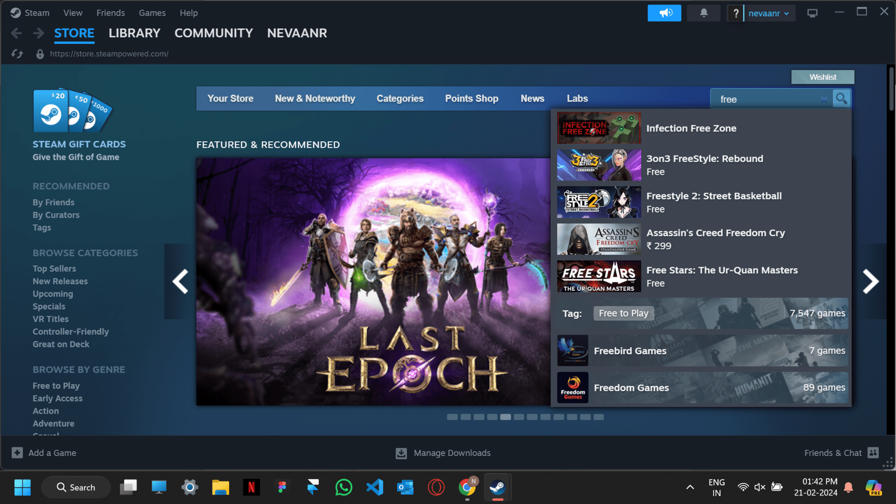
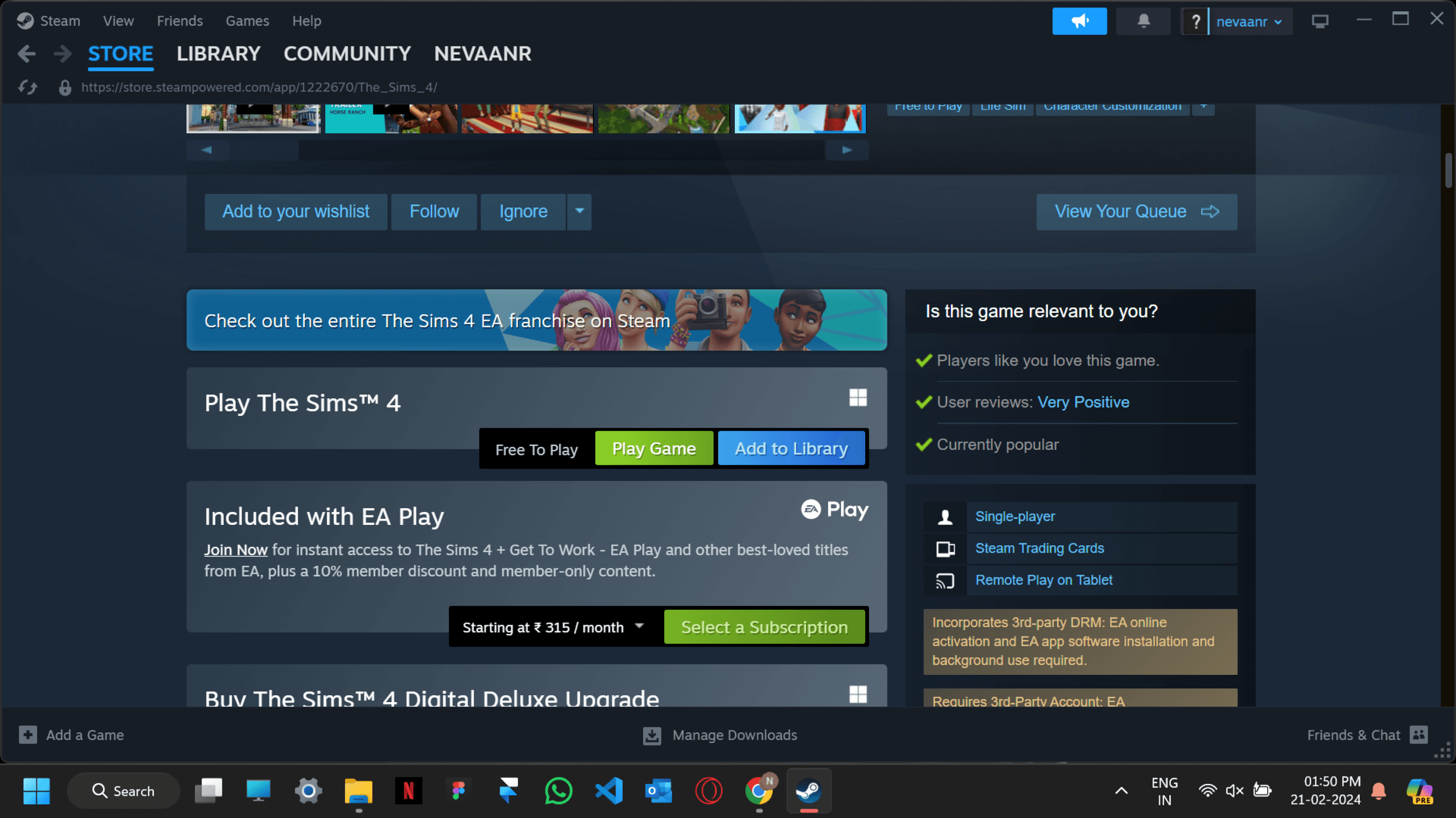
Task 1 : Buying and Installing The Sims 4

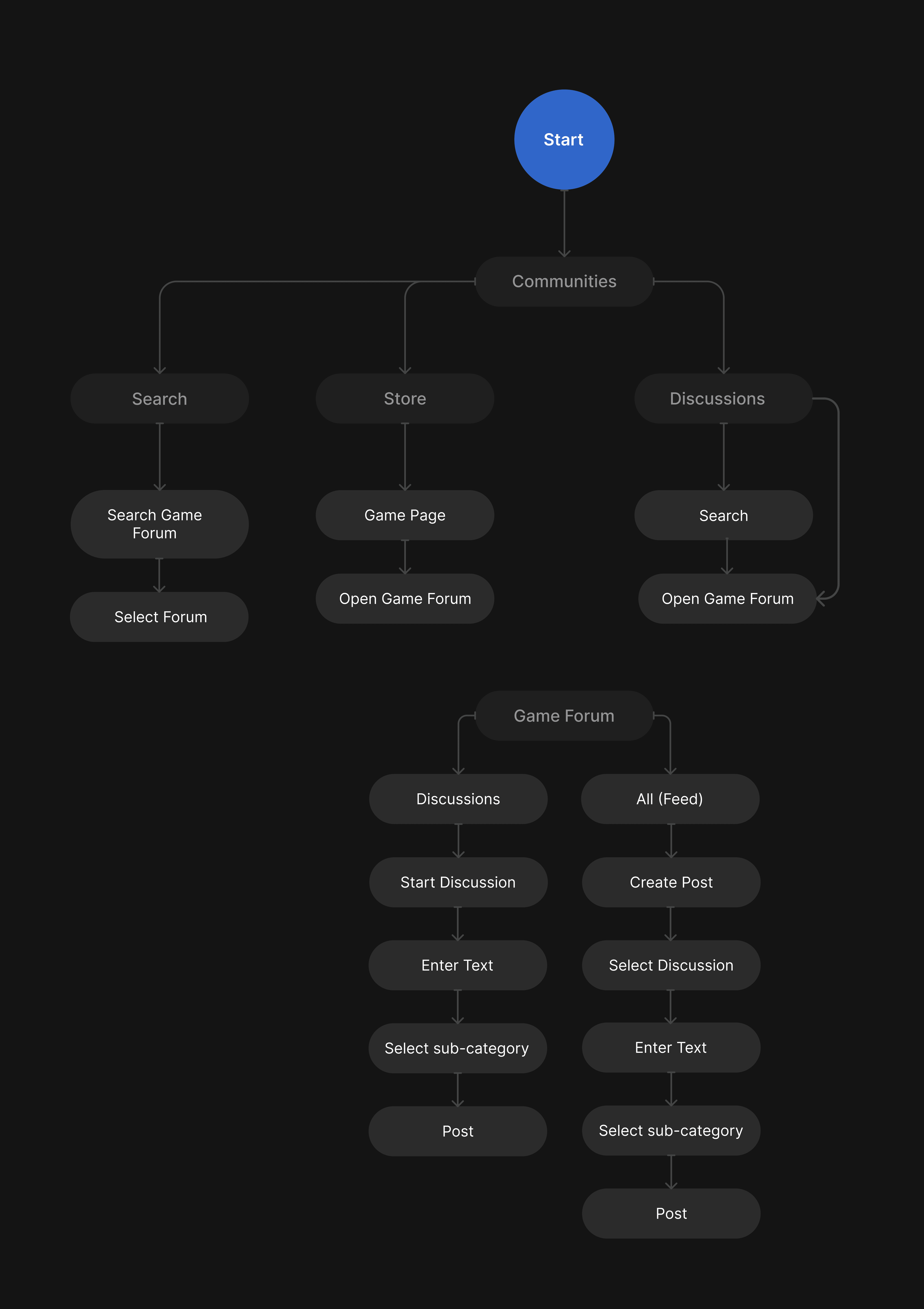
Task 2 : Starting a new discussion in Red Dead Redemption 2 under Game community
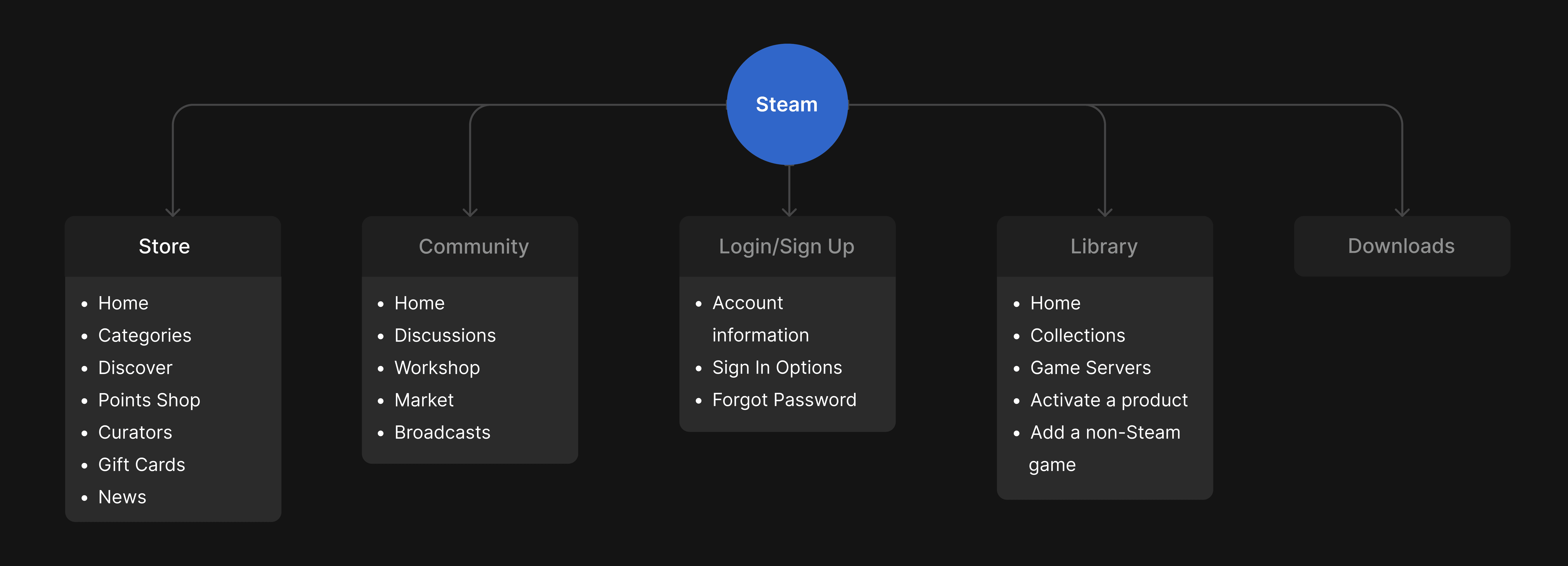
Information Architecture
Design System
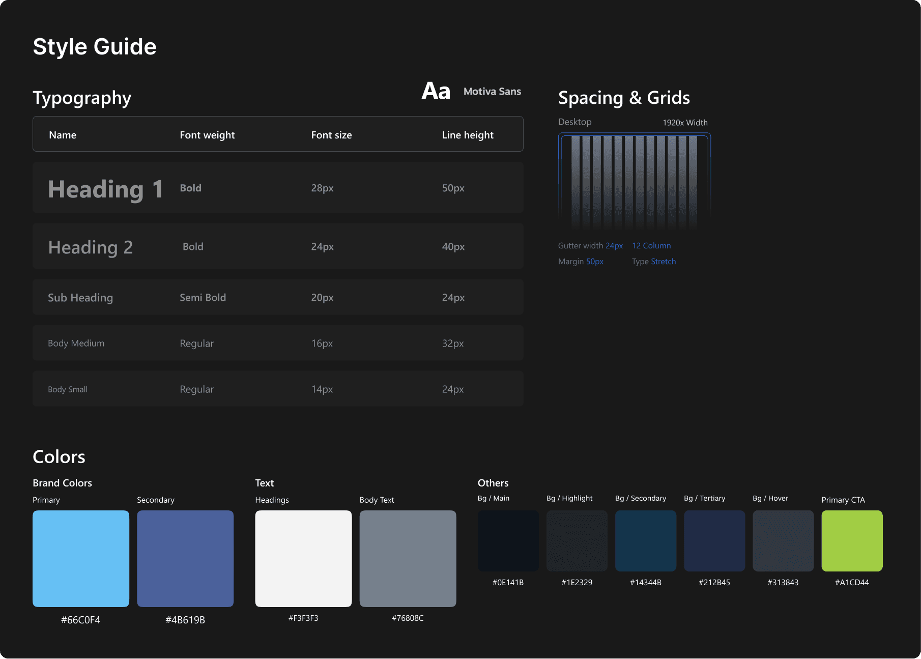
Style guide
Component Library

UI Screens
Low-fidelity Wireframes

High Fidelity Wireframes


Live Figma Prototype
Usability Testing
Testing Process
Task 1 Probing Questions
What is the difficulty you faced while performing?
How were you able to find the functions/features that you want?
What is your impression about this particular feature?
Were you able to find the information and cues you needed to proceed?
Is there anything that you didn’t like?
Task 2 Probing Questions
Reflect on any specific challenges or aspects that you encountered during the task.
How were you able to find the functions/features that you want?
What is your impression about this particular feature? Why?
Were you able to find the information and cues you needed to discover/proceed? If no, where did you get stuck? Do you have any suggestions to improve? Or did you think of any other way or path to achieve this task?
Is there anything that you did not like?


Usability Test Insights
Users demonstrated a proactive approach by exploring various features of the prototype. However, disappointment was expressed due to the prototype's lack of full functionality, suggesting a desire for a more immersive testing experience.
Users expressed satisfaction with the newly introduced categorization options, indicating successful enhancements in content organization and accessibility.
Users encountered difficulties navigating post-purchase actions, such as installation, within the prototype. This highlights the importance of ensuring seamless transitions and clear guidance throughout the user journey.
Users particularly liked the layout of the store page, especially for additional content and DLCs. This suggests that the redesign effectively optimized key sections of the platform for user engagement and exploration.
Users encountered difficulties in navigating the community page, particularly when attempting to find discussions. This highlights the importance of improving the accessibility and clarity of community features within the redesigned interface.
Users found the process of creating a community post to be straightforward, indicating successful simplification of this task within the prototype.
Some users were unclear about the objectives of certain tasks, indicating a need for clearer instructions or explanations to guide their interactions with the prototype effectively.
Users hoped for smoother functionality within the library section. Confusion arose, particularly after purchasing a game, indicating a need for clearer guidance on post-purchase actions.
Some got confused between the redesigned steam and the original Steam app. While others pointed that the redesign is too subtle to make the redesigned features noticeable and hence did not find their experience to be improved by a lot. Note that these users were experienced users.
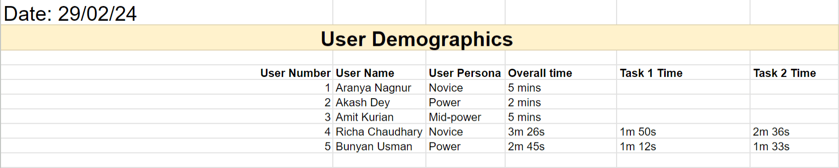
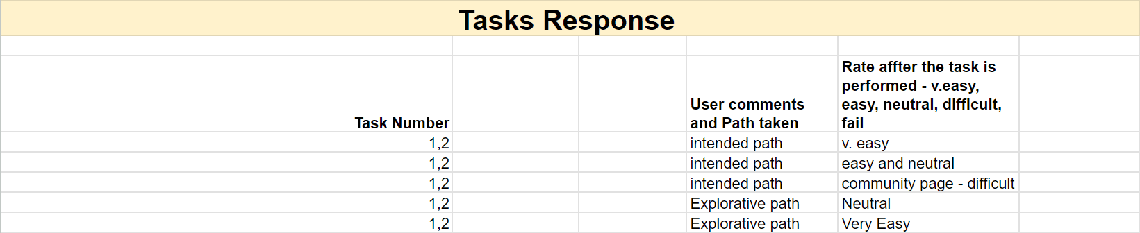
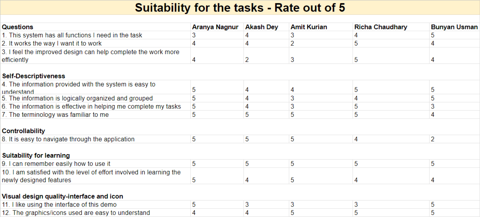
Usability testing data Sheet

Insights & Learnings
Identification of Strengths
The evaluation process effectively highlighted positive aspects of the redesigned UI, such as improved layout and categorization options.
Users' appreciation for certain features, like the store page layout and ease of community post creation, indicates successful implementation of desired changes.
Awareness of Design Bias
Recognizing personal biases towards redesigning a product is essential. It's crucial to acknowledge that what might seem like an improvement from a designer's perspective may not necessarily align with users' preferences or needs.
Being mindful of these biases helps in approaching the evaluation process with an open mind, prioritizing user requirements and feedback over personal preferences or assumptions.
Areas for Improvement
Prototype Functionality: Addressing limitations in prototype functionality is crucial to providing users with a more realistic testing experience and gathering comprehensive feedback.
Clarity in Task Instructions: There is a need to enhance clarity in task instructions to minimize user confusion and ensure consistent understanding across participants.
Seamless Navigation: Improving navigation pathways, particularly within the community page and post-purchase actions, is essential for enhancing user experience and reducing frustration.
Post-Purchase Guidance: Enhancing guidance on post-purchase actions, such as installation instructions, is necessary to facilitate smooth transitions and ensure user satisfaction.
Library Accessibility: Improving visibility and accessibility of essential features
Avoiding probing questions during testing prevents unintentional influence on user responses or behaviors. Probing questions may inadvertently steer users towards desired responses, skewing the validity of the feedback obtained.
Regularly soliciting feedback from users and stakeholders facilitates ongoing refinement and optimization of the user experience, driving long-term success and user satisfaction.